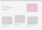
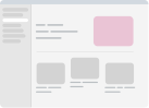
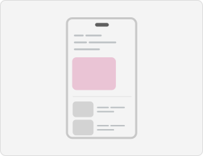
Responsive design is more than the viewport size.
Users browse a website in more ways than desktop and mobile, such as docked developer tools, an open keyboard, in-app browsers, split views, and more.
Take a lookUsers browse a website in more ways than desktop and mobile, such as docked developer tools, an open keyboard, in-app browsers, split views, and more.
Take a look